> ## Documentation Index
> Fetch the complete documentation index at: https://docs.dynamic.xyz/docs/llms.txt
> Use this file to discover all available pages before exploring further.
# DynamicWidget
For new React apps, we recommend the JavaScript SDK with React Hooks (`@dynamic-labs-sdk/react-hooks`) instead of the legacy React SDK documented here. The JS SDK comes with many benefits such as a much smaller bundle size and other optimizations. Use the [React quickstart (JavaScript SDK)](/javascript/reference/react-quickstart) to get started.
### Summary
Once a user connects their wallet, you may want to display a navigation component to show the current wallet and connected network. Additionally, if you collected information during onboarding, you may want to display the user's profile so they can edit their information, add additional wallets (if you [enabled multiwallet](/react/wallets/external-wallets/multi-wallet)), and more.
The DynamicWidget is the parent component that has all these features available in it. If you want to explore sub-components for more granular control, then see [DynamicConnectButton](/react/reference/components/dynamicconnectbutton) [DynamicUserProfile](/react/reference/components/dynamicuserprofile) and the [DynamicNav](/react/reference/components/dynamicwidgetnav) components.
If you need to embed the modal directly into your site without the need for button first, then we recommend exploring [the EmbeddedWidget](/react/reference/components/dynamicembeddedwidget) instead.
### Settings
There are two settings available when you initialize the `DynamicWidget` in your App.
| Method | Description |
| --------------------------------- | ------------------------------------------------------------------------------------------------------------------------ |
| innerButtonComponent?: ReactNode; | This is an optional component passed in to DynamicConnectButton. Defaults to Connect your wallet |
| variant?: 'modal' \| 'dropdown'; | Specifies whether to show DynamicWidget as a centered modal or a dropdown from the DynamicNav button. Defaults to modal. |
### Examples
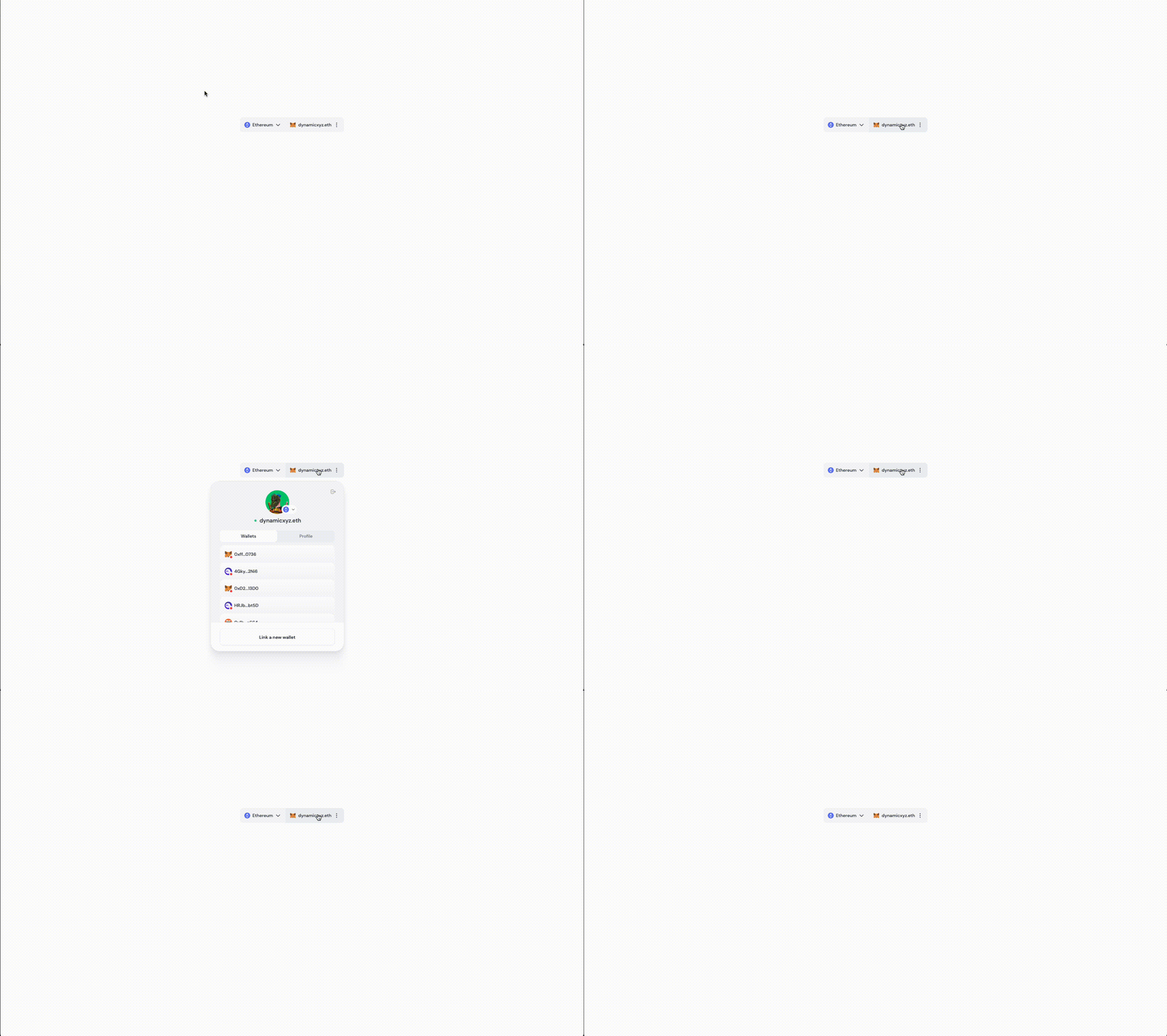
#### variant = modal
```TypeScript theme={"system"}
import { DynamicContextProvider, DynamicWidget} from '@dynamic-labs/sdk-react-core';
const App = () => (
);
export default App;
```
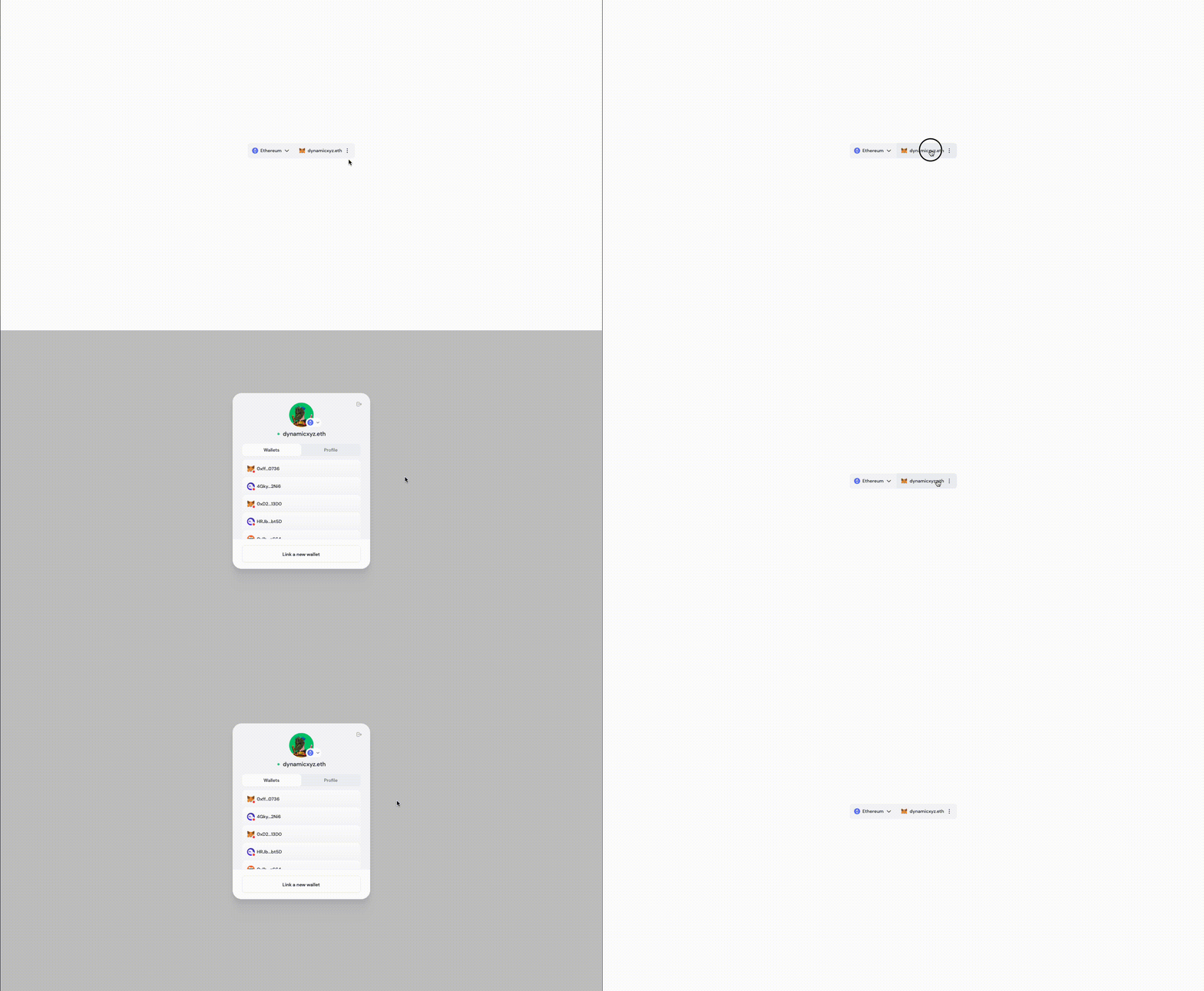 #### variant = dropdown
```TypeScript theme={"system"}
import { DynamicContextProvider, DynamicWidget} from '@dynamic-labs/sdk-react-core';
const App = () => (
);
export default App;
```
#### variant = dropdown
```TypeScript theme={"system"}
import { DynamicContextProvider, DynamicWidget} from '@dynamic-labs/sdk-react-core';
const App = () => (
);
export default App;
```